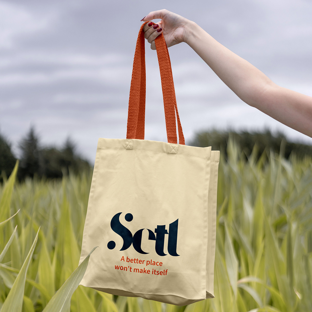
Setl: Defining a Cohesive Brand Identity
Setl’s mission is to measurably move, motivate, inspire, and ease the mind through multisensory live events designed to promote meaningful shifts in mental state. Through the convergence of music and visual art, Setl seeks to reduce stress and heal the nervous system. Their purposefully composed original music and artwork provide a positive mental and emotional stimulus. Cutting-edge immersive audio technology enhances the experience with spatial audio design, while VR, XR, and projection transport users to new dimensions through passive viewing or interactive play.
The approach
The design process began by delving into the core of what Setl represents: simplicity, balance, and forward-thinking innovation. The logo’s design was inspired by stone cairns, symbolizing balance and grounding. The letter shapes taper to fine points, giving the logo an ethereal quality, as if it might fade away like stress itself. This intentional design reflects the calming and restorative nature of Setl’s experiences.
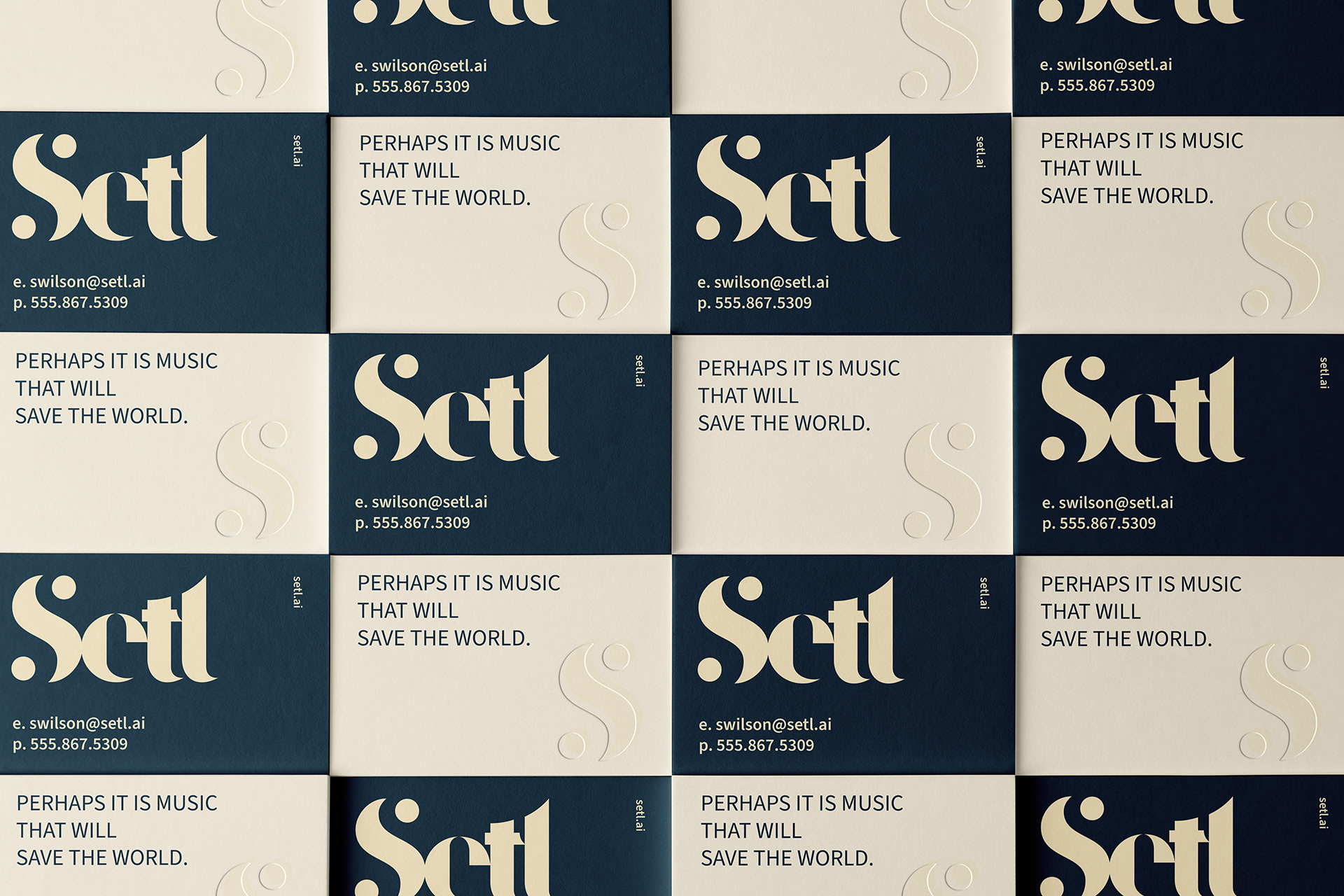
Business cards
From concept to execution
The new visual identity served as a foundation for Setl’s broader brand strategy. The color palette, inspired by nature—particularly the soft gradients of sunrises and sunsets—evokes tranquility and renewal. This cohesive design system was implemented across their website, creating a seamless user experience that aligns with their core values. Social media templates, marketing collateral, and presentation decks were also developed to ensure consistency and recognition across all touchpoints. The unified visual identity positioned Setl as a trusted leader in creating sustainable, artistically-driven mind-body regulation experiences.
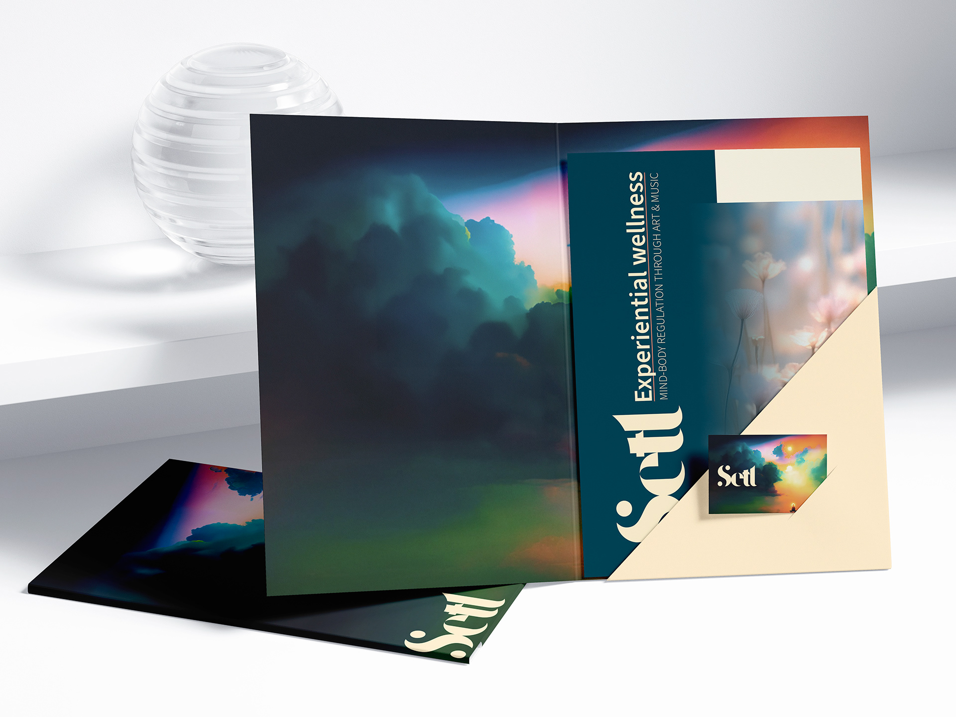
Brochure and folder

Mug
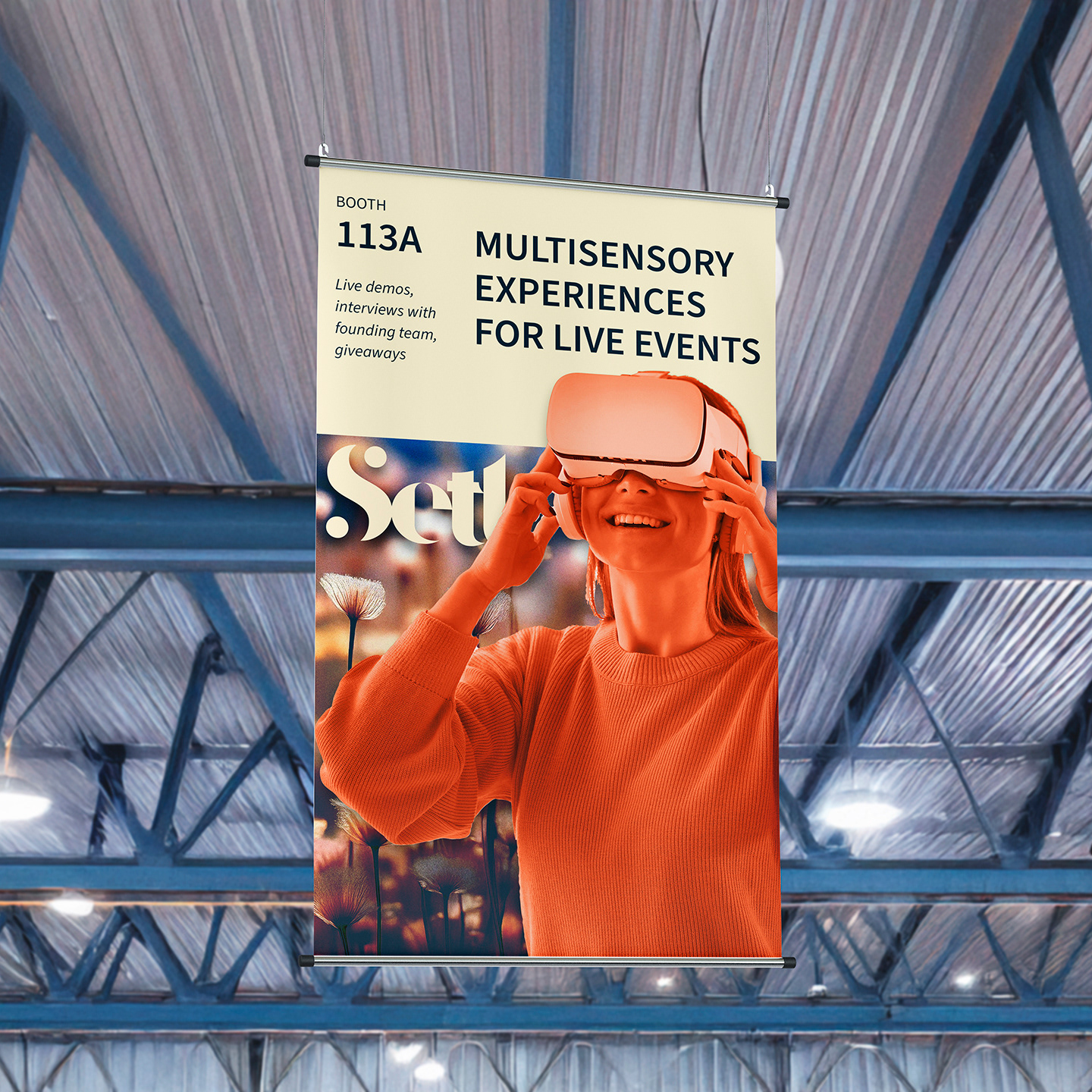
Hanging trade show banner
